The studio notebook
Six pictures from a year of looking closer.
A year of visual references, from the glow of a pendant to a bowl on a painted table. Each picture holds a small observation about light, material or the way a room makes us feel.
January
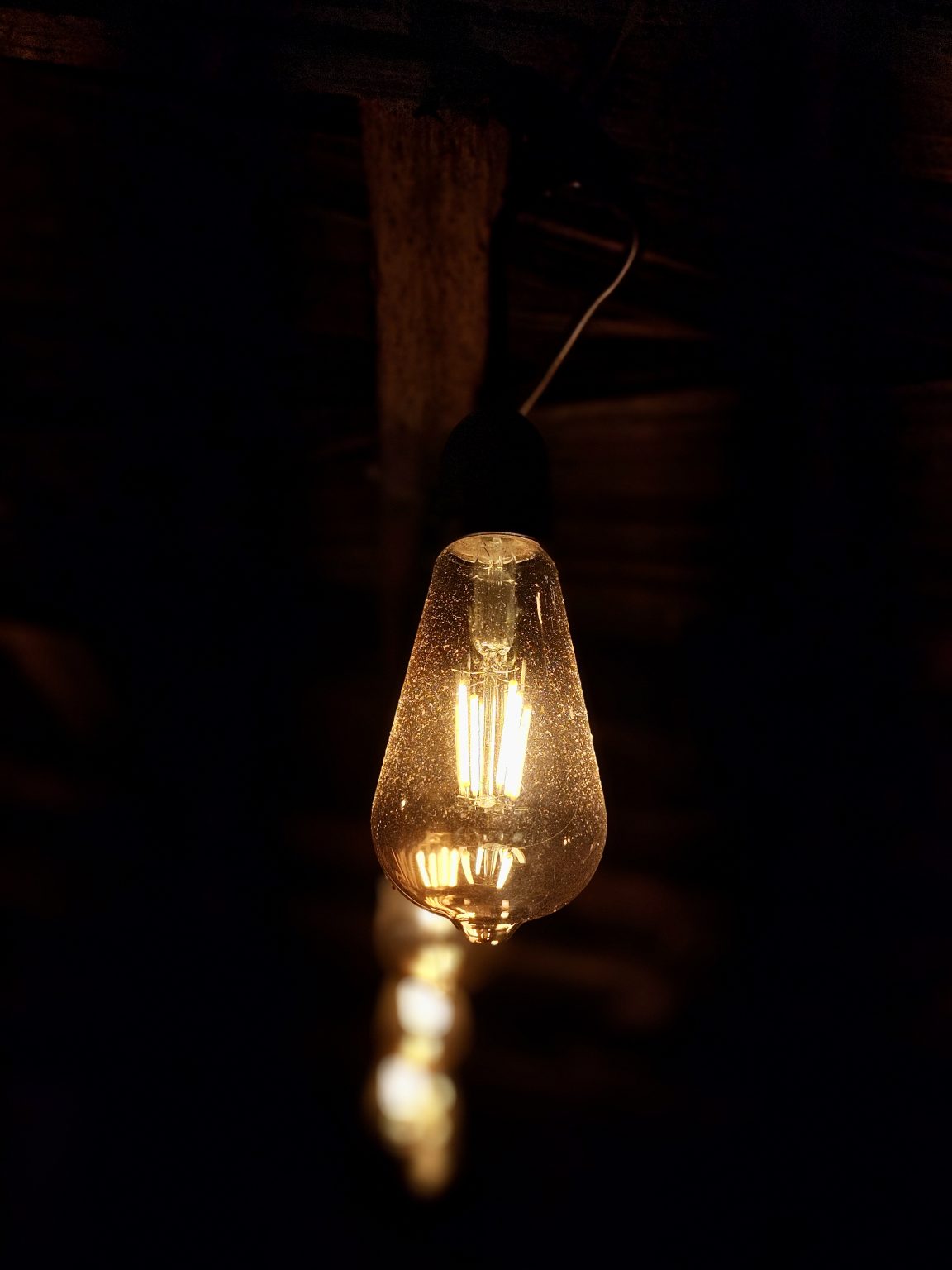
A pool of warm light
The notebook opens with a pendant glowing against a dark room. Its textured shade catches the light at the edges, giving a familiar object a little more depth. The darkness around it makes the warmth feel stronger.
A useful starting point for an interior: decide where the light should gather before deciding how much of the room to reveal.

March
A pause by the sea
Pale sand meets turquoise water beneath a pair of palms. The trunks frame a clear view of the shoreline, while soft shadows cross the foreground. The open stretch of beach gives the composition room to breathe.
We kept this reference for its openness: natural framing, warm light and a clear horizon that lets the eye rest.
May
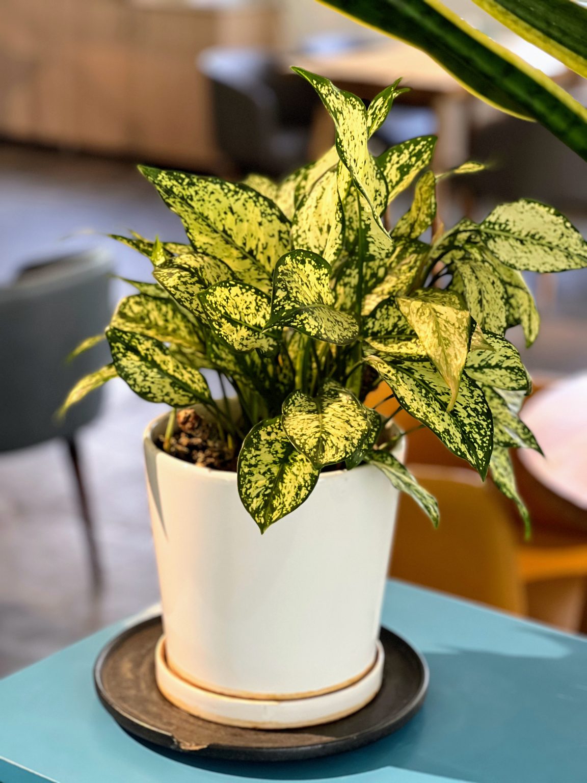
A palette that grows
The leaves of a potted plant bring green and cream together in uneven patches. Some edges are sharp, others almost disappear. The colour is lively because the proportions keep changing from one leaf to the next.
For the studio palette, the useful detail is the balance: a little brightness against a larger field of green, with room for both.
July
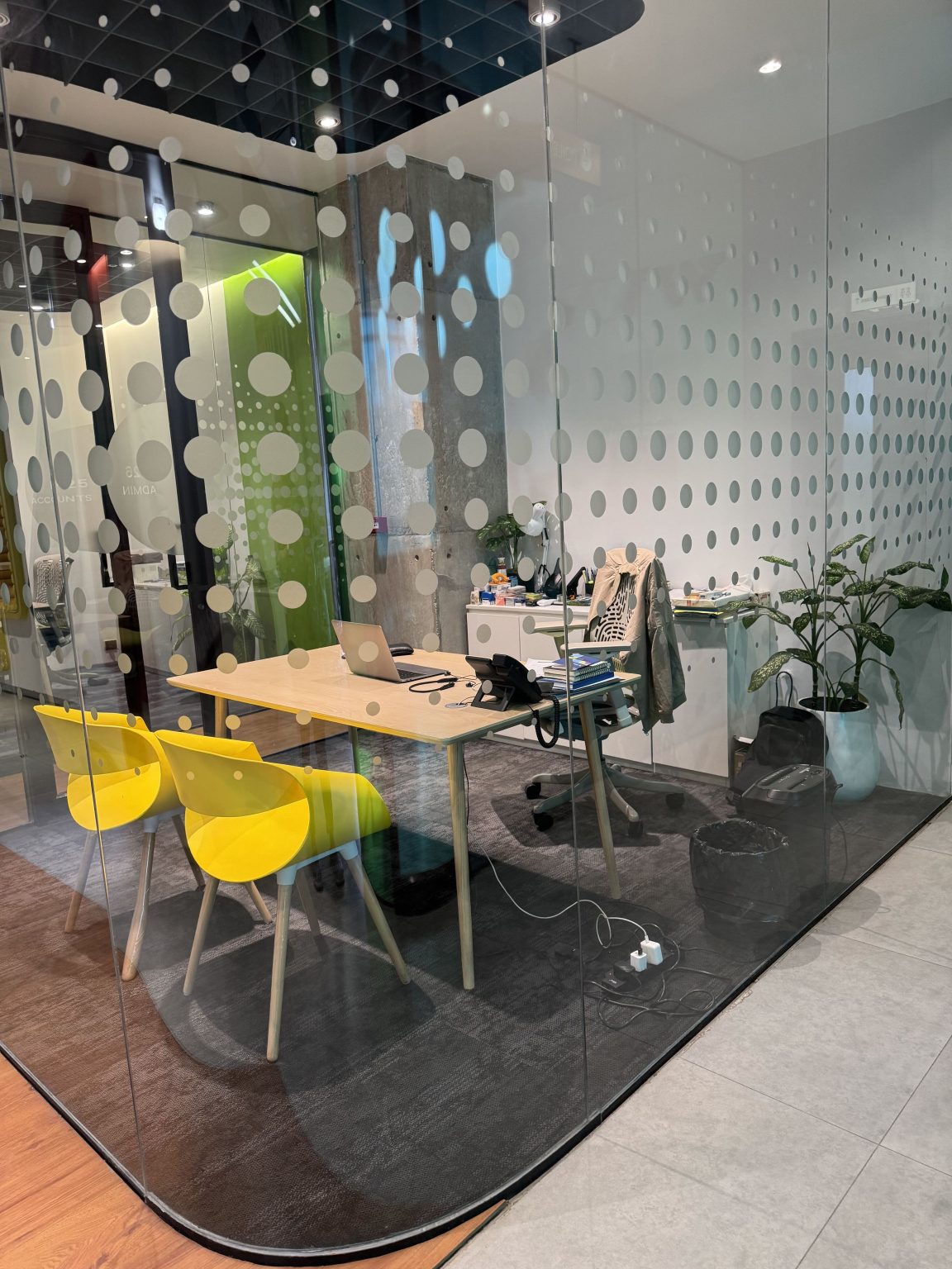
A room within a room
Patterned glass gives a shared workspace a softer boundary. Yellow chairs, plants and a table remain visible behind it, while the repeated marks interrupt the view. The room feels connected to what is outside without being completely exposed.
It is a reference for separating spaces with light and pattern, while keeping the activity on the other side part of the picture.
September
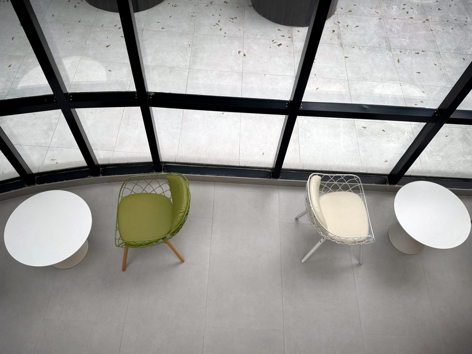
A place by the window
Seen from above, small round tables and pale chairs gather beside tall windows. A green seat adds a quiet note of colour. The dark window frames give the loose arrangement a structure without making the furniture line up.
This is the corner we return to when a room needs somewhere to pause: daylight, a comfortable seat and space between the pieces.
November
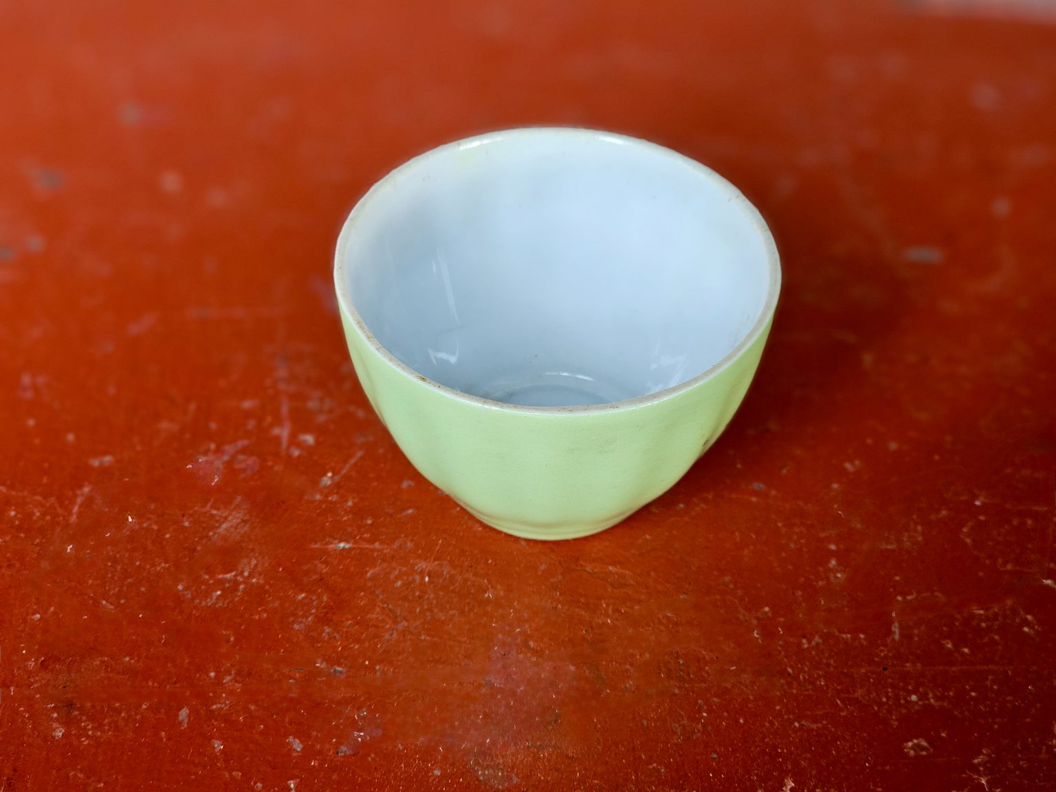
A small colour study
A pale green bowl rests on a warm red tabletop. The smooth ceramic and the worn surface give the colours different weights, while the empty space inside the bowl makes the pairing feel simple. Nothing else needs to enter the frame.
The last note of the year is about scale: a whole room can begin with the relationship between two small things.
The full review
The full notebook brings these observations together with material references and sketches. Keep it nearby when a new room needs a starting point.