Blog Reference
Why does my WordPress block pattern look different from the demo?
Find out which differences come from your WordPress theme, which reveal a broken pattern, and what to check before adding another CSS override.
A WordPress block pattern can look different from its demo because the demo's theme supplies styles that your site does not share. Fonts, colours, button shapes and content widths can all change when the same blocks meet a different theme. Start by identifying which difference you are seeing: a new typeface may be expected, while missing text or a section spilling off the screen needs investigation.
The useful question is whether the pattern still works within your site's design. Chasing every difference with an extra CSS rule can leave you maintaining a second design system inside one page.
The same blocks can produce a different design#
For this comparison, an unchanged pattern containing a Group, heading, paragraph and button was rendered through WordPress in Twenty Twenty-Five and Twenty Twenty-Four. The pattern chose a constrained layout and spacing presets, but declared no colour, font family or font size.
Twenty Twenty-Five:

Twenty Twenty-Four:
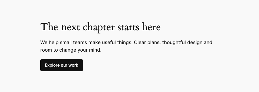
These are WordPress renders, captured on 6 September 2026 using WordPress 7.0.4 and PHP 8.3.32. Both desktop captures used a 900px browser viewport. The browser's computed styles and loaded font faces gave these results:
| Measured property | Twenty Twenty-Five | Twenty Twenty-Four |
|---|---|---|
| Heading font | Manrope | Cardo |
| Paragraph font | Manrope | Inter |
| Paragraph width | 645px | 620px |
| Page background | White | Pale grey |
The same markup also fitted a 390px viewport without horizontal overflow in either theme. That establishes how this example behaved in those configurations; it does not establish that every pattern will behave that way. No theme files were edited to make the comparison agree.
Find the source of the style before changing it#
The active theme is only part of the styling story. WordPress combines its defaults with the theme's configuration, any child-theme configuration, and the changes saved through Global Styles. Saved user choices take priority within that configuration hierarchy, so the current theme.json file may not describe the final appearance of your site. WordPress documents that hierarchy here.
An individual block can also carry explicit settings, and stylesheets can target its classes. If every heading differs from the demo, look at your site's heading styles first. If one heading differs from the surrounding page, inspect that block's typography settings and the CSS rules that actually match it.
An explicitly selected colour or font size may be intentional. Resetting it should be a decision about that block, rather than a wholesale reset of a client's saved styles.
A colour slug needs a definition#
A palette colour is identified by a slug. WordPress uses that slug to generate a CSS custom property and corresponding classes. The names belong to the palette: there is no compulsory colour naming scheme shared by every theme, although base and contrast are recommended conventions. The palette documentation explains the distinction.
Consider this paragraph:
<!-- wp:paragraph {"textColor":"demo-ink"} -->
<p class="has-demo-ink-color has-text-color">A colour name is not a colour definition.</p>
<!-- /wp:paragraph -->
In a separate test on both themes, demo-ink had no custom property and no matching colour rule. The paragraph still rendered, inheriting its parent's dark text colour without a PHP notice. Selecting the defined contrast preset produced a colour rule, but looked identical in this case because it resolved to the same foreground colour.
That is why an apparently correct screenshot cannot prove that a preset exists. In browser developer tools, inspect the element's matched styles and computed colour, then check whether the referenced custom property is defined. If the pattern needs a specific colour role, assign a suitable preset from your site's palette and check it against the actual background.
Conversely, a fixed colour value can keep working while ignoring a rebrand. Inspect the block's colour selection before assuming the theme failed to update it. The guide to theme.json colour presets explains the underlying mechanism in more detail.
A missing preset can make a heading disappear#
Here is a deliberately broken example in Twenty Twenty-Five. The Group has a dark contrast background, and the paragraph and button use colours the theme defines. The heading asks for demo-paper, a light-text preset that this theme does not have.
Before: the heading's colour preset is missing.
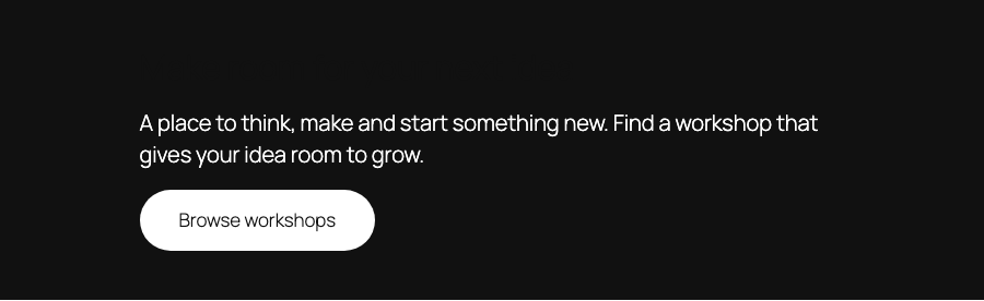
The heading "Make room for your next idea" is still in the page. Its computed colour is #111111, identical to the panel's background, so it disappears visually while continuing to occupy space. This is a colour failure that needs fixing.
After: the heading uses the theme's defined base preset.
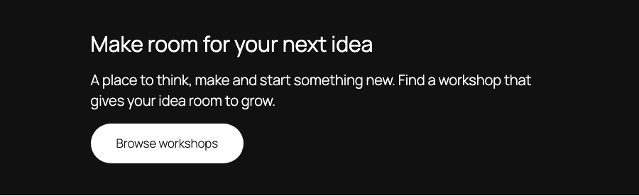
Only the heading's colour selection changed. In saved block markup, that means replacing demo-paper with base in both the block attribute and its colour class:
<!-- wp:heading {"textColor":"base"} -->
<h2 class="wp-block-heading has-base-color has-text-color">Make room for your next idea</h2>
<!-- /wp:heading -->
These captures were measured on 6 September 2026 with the same WordPress and PHP versions as the first comparison. The corrected heading resolved to white, #FFFFFF; the paragraph, button and panel dimensions stayed unchanged. Both versions fitted 900px and 390px viewports without horizontal overflow, showing why a layout check alone would miss this problem.
On your site, select the Heading block and choose an appropriate light colour from its Text colour settings. Check the actual swatch against the panel: base is white in this configuration, but its name does not guarantee white in another theme or style variation.
Width belongs to the surrounding layout too#
A section can be narrow because its parent constrains it. The theme's settings.layout.contentSize and wideSize define the normal and wide measures, while the surrounding Group or Post Content block determines how those measures apply to its children. A wide alignment setting has to be understood in that parent context. WordPress's layout guide illustrates these relationships.
Open List View and select the Group around the pattern, then inspect its parent. Check the template's content area before adding a fixed width to the section. Forcing a child wider can introduce overflow while leaving the original constraint unexplained.
Typography changes geometry as well. A different font, weight or line height can wrap a heading sooner and make its section taller. Compare with the same text and a confirmed loaded font; a declared font-family name alone does not prove that its font file arrived. The fluid typography guide covers the size settings separately.
A saved class does not carry its stylesheet#
Some patterns depend on styles registered by their original theme or a plugin. A class can remain in the saved markup after the stylesheet that gave it meaning has gone away. The blocks are present, but a distinctive treatment disappears.
Look for a selected block style or an additional CSS class when the missing detail is a border treatment, layout or decorative effect. WordPress block styles use classes such as is-style-hand-drawn; the class is a reference to styling, not the styling itself. The block-style documentation shows how that connection is registered.
If the original source requires a particular theme or plugin, establish whether keeping that dependency fits the project. For a design you need to own, recreating the treatment in your maintained theme may be appropriate, but it adds code you must test and support. A missing custom block or interactive behaviour is a separate dependency issue, beyond changing colours and spacing.
Decide what must match, then fix one cause#
Exact reproduction can be the right requirement for an approved campaign page. In that case, obtain the original fonts, images, theme settings and required supporting styles, including the rights to use those assets. Budget for the work of preserving that appearance as the surrounding site changes.
For a section that should belong to a client's existing site, agreement with the site's typography and palette is usually more useful than agreement with a catalogue screenshot. Preserve the content hierarchy, usable controls and responsive layout, then make deliberate decisions about the differences.
Before changing the live page:
- Duplicate the affected page on staging and record the specific mismatch.
- Inspect the block and its parent layout before editing global settings.
- Check the preset, font or stylesheet that supplies the disputed value.
- Change one cause and compare the editor with the published front end.
- Check narrow screens, long headings and the actual foreground/background pairing again.
Keep the change that resolves the mismatch. Remove any temporary overrides added while investigating, so the next person can still tell where the section's design comes from.
The adaptive patterns in Pattern Paste use theme presets. You can browse the library and preview them with your theme settings.
Read next
- theme.json colour presets, and why a pattern should never state a hexHow WordPress turns a palette in theme.json into CSS custom properties, what breaks when a pattern hardcodes a colour, and the fallback chain that fixes it.27 August 2026
- Where block patterns come from, and what each source leaves in your pageThe pattern directory, your theme, a library plugin or a copy-paste catalogue: what each source puts in post_content, and what survives when it goes away.31 August 2026


