

How to build a landing page in WordPress without a page builder
A landing page in Twenty Twenty-Five from core blocks and patterns, section by section: template, hero, proof, features, steps, pricing, FAQ and the closing ask.
A landing page in WordPress needs no page builder: a block theme such as Twenty Twenty-Five, a template without the page title, and between six and eight sections built from Cover, Group, Columns, Buttons and Details. Each section is a block pattern you insert and rewrite. The work is not the building; it is deciding what each section has to say, in what order, and checking it on a phone.
This walk-through uses Twenty Twenty-Five, the default theme since WordPress 6.7 (November 2024), but nothing in it is specific to that theme. Any block theme with a colour palette and font sizes in theme.json takes the same steps.
Start with a page that has nothing on it#
A landing page is a page, not a post, so create it under Pages. In the Settings sidebar, open the Template panel and pick a template that leaves out the page title: Twenty Twenty-Five ships one called Page No Title. Your hero carries the headline, and a second, smaller title above it reads as a mistake.
Decide now whether the page keeps the site header. Keeping it costs a few distractions and buys trust: a visitor who lands from an advert can see whose site they are on. Dropping it means a custom template in the Site Editor with no header template part, and every page that uses that template loses the way back to the rest of the site.
Then write the page in a text editor before you touch a block. One line per section, in order:
- What it is and who it is for.
- Who already uses it.
- What it does, in three or four points.
- How it works, in steps.
- What it costs.
- The questions that stop people buying.
- The ask, once more.
If a line is blank, the section does not go on the page. An empty FAQ with invented questions is worse than none.
The hero: Cover or Columns, one button#
The hero is the only section every visitor reads. It needs a headline that names the offer in plain words, one supporting sentence and one button. A second button labelled "Learn more" splits the click and usually loses to the first.
Two core layouts do the job:
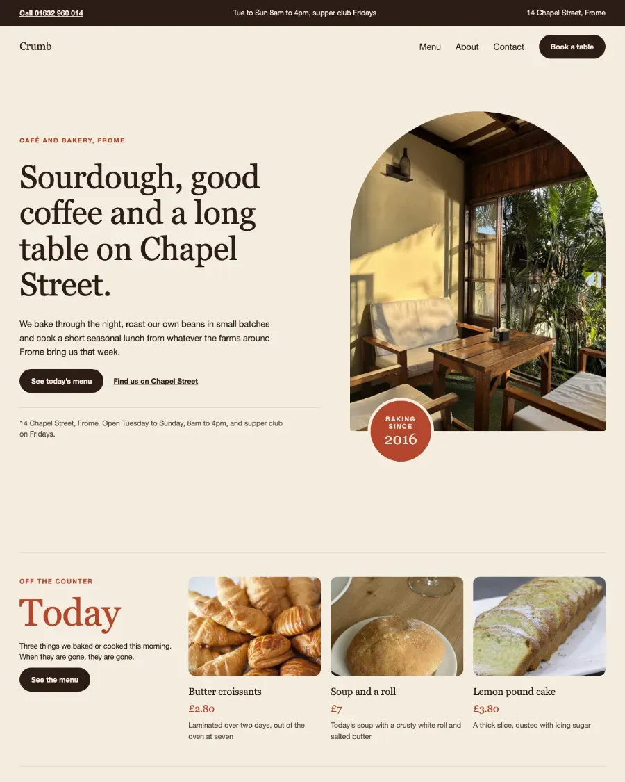
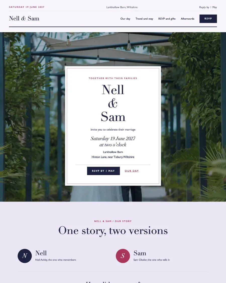
- Cover, when a photograph carries the offer: a café, a venue, a tradesperson's finished work. Set a dim or overlay strong enough that the text passes contrast on the brightest part of the image, not the average.
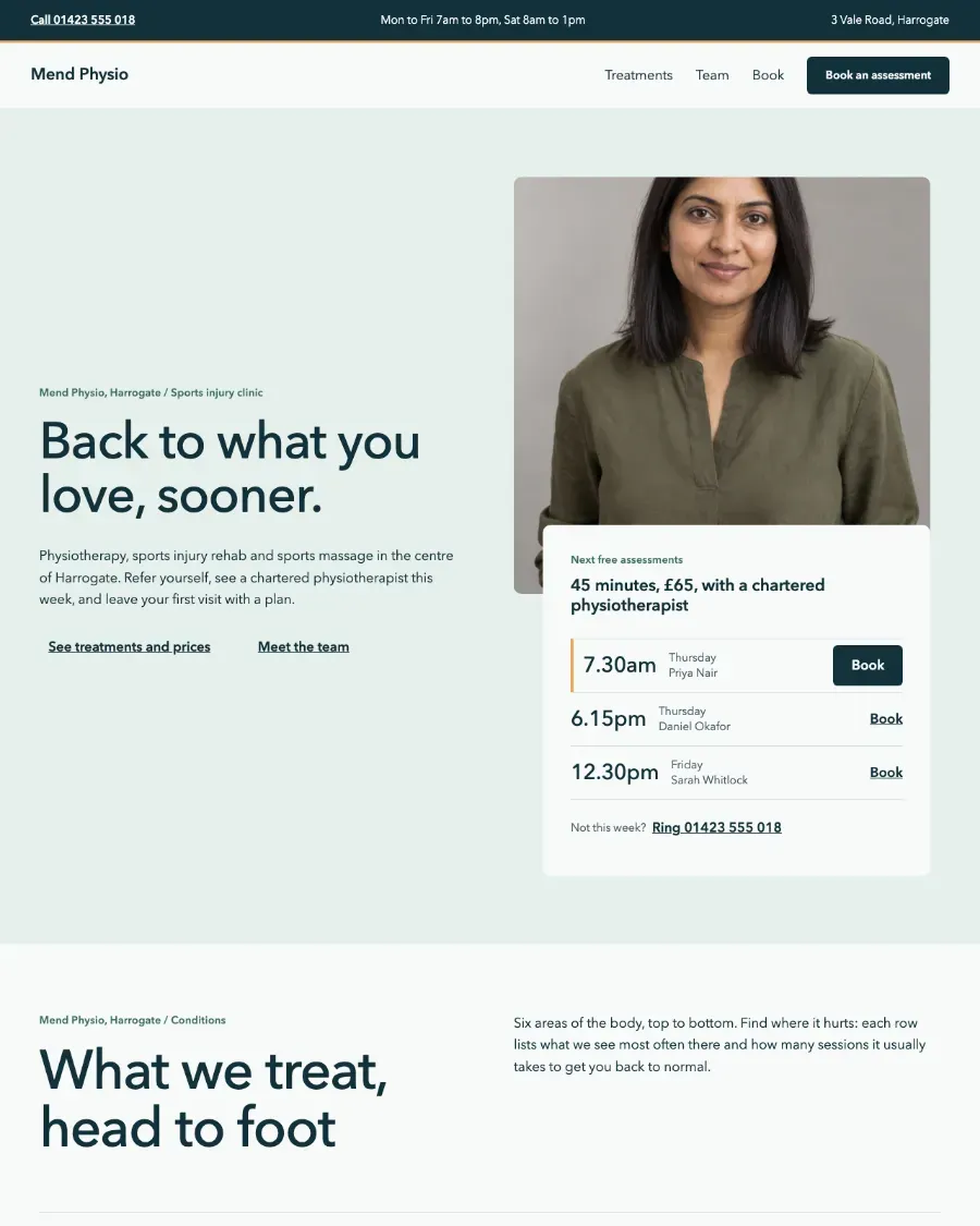
- Columns, text on one side and an image on the other, when the product is a screenshot or the photograph is not strong enough to sit behind type.
Set the headline with a font size preset from the theme, not a custom pixel value. Twenty Twenty-Five's presets are fluid, so the heading shrinks on a phone without a separate mobile setting. A typed 64px stays at 64 on a 390px screen and wraps one word per line.
<!-- wp:heading {"level":1,"fontSize":"xx-large"} -->
<h1 class="wp-block-heading has-xx-large-font-size">Boiler servicing in Leeds, booked online</h1>
<!-- /wp:heading -->
Use h1 here and nowhere else on the page. The template has no title, so this heading is the page's only first-level one.
Proof, before the features#
The section under the hero answers "is this real?". A row of client logos, one strong testimonial or a line of numbers all work; pick the one you can back with something true. A testimonial needs a name and a role a visitor could check. A logo row needs permission to use the logos.
Build a logo row as a Group with the Row layout and Image blocks inside, each image given a fixed height and an alt text naming the company. Keep it to one row on desktop; on a phone, the Row layout wraps.
Features: a grid that keeps its rhythm#
Features are where a landing page usually goes wrong, because three cards with an icon each look finished before the words are good. Write each point as a short heading that is a claim and a sentence that is the evidence.
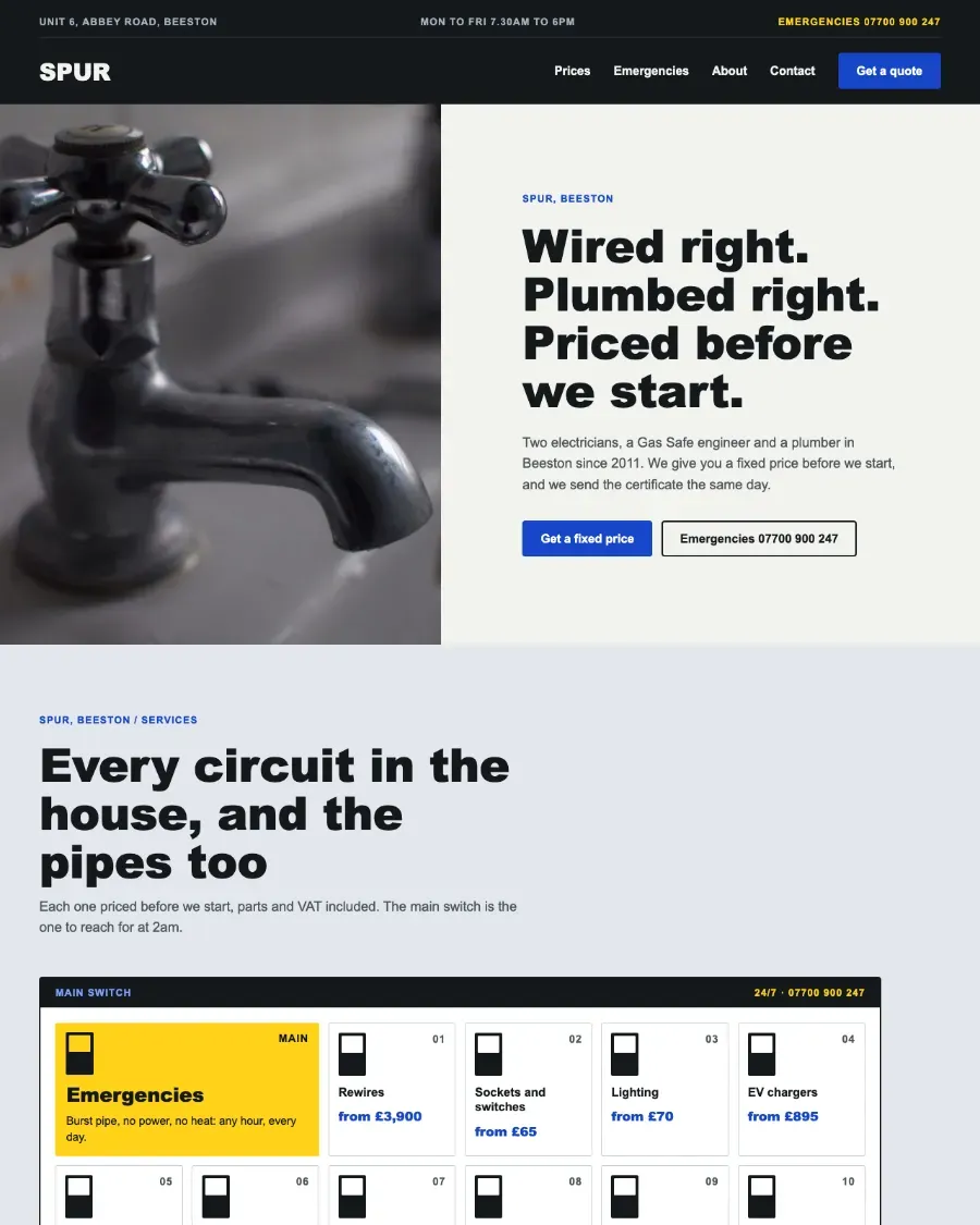
Use a Group with the Grid layout rather than Columns for more than three items. Grid sets a minimum column width and wraps on its own; Columns stacks only at a fixed breakpoint and leaves four narrow cards squeezed on a tablet. Set the minimum column width to something a sentence fits in, around 16rem, and the grid becomes two columns on a tablet and one on a phone without any setting per device.
Steps, when the buyer is unsure what happens next#
A how-it-works section earns its place when the purchase has a process: book, visit, quote, start. Three or four numbered steps, each a heading and a sentence, in a grid or a single column. Number them with a heading or a paragraph rather than an ordered list styled to look large, so the numbers survive a theme change.
Skip this section for a product whose next step is obvious. A visitor does not need "1. Click buy. 2. Receive download."
Pricing and FAQ: answer the objection where it is raised#
If the page sells something with a price, show the price. A pricing section in core blocks is Columns with a Group per plan, a List of what is included and one Button per plan. Mark the recommended plan with its own background colour from the palette, not a "Most popular" badge alone; a badge is text that screen readers read in the wrong place.
The FAQ goes directly under pricing, because that is where the questions start. Use the Details block: each question is the summary, each answer the content, and the browser handles opening and closing with no script. Collect the questions from real enquiries, sales calls or support emails.
The closing ask, and what goes below it#
End with a call to action: a full-width Group with the theme's contrast or accent background, a headline that repeats the offer in different words, and the same button as the hero. Then the site footer, from the template, with contact details for the visitor who scrolled this far looking for a phone number.
Do not add anything between the closing ask and the footer. A newsletter sign-up there competes with the one action the page exists for.
Check it on a phone before anyone else does#
The block editor shows the page at desktop width, and WordPress does not warn you when a section fails on a small screen. Open the published page on a phone, or at 390px in your browser's device tools, and look for four things:
- A headline that wraps one word per line, which means a custom font size.
- A Columns block that has not stacked, leaving text in a narrow strip.
- Text on a Cover that fails contrast on the bright part of the photograph.
- Buttons smaller than a thumb, often a link inside a paragraph rather than a Button block.
Then switch the theme's style variation in the Site Editor, under Styles. A section that keeps its colours when the variation changes has a colour typed into it, and it will keep that colour after the next rebrand too. Why patterns look different from the demo covers how to find and replace those values.
What to do on Monday#
Write the seven lines before opening the editor. Create the page with a no-title template, insert one pattern per line from the inserter's Patterns tab, and rewrite every word of placeholder copy. Check it at 390px, switch the style variation once, and fix whatever did not follow it. If you have not inserted a pattern before, adding a block pattern covers each way in.
Pattern Paste has these sections built in core blocks with no colour or font of their own, so they take Twenty Twenty-Five's palette and type as soon as they are pasted; 64 of them are in the free plugin, and the full library is on pricing.
From the library